
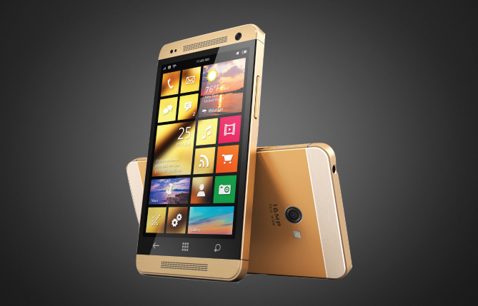
2016 Is The Year Of The Mobile Website
Is Your Website Mobile Friendly?
If you’re planning to establish a mobile presence for your business or organization, one of the first considerations that will likely come to mind is whether you want to create a mobile application for users to download a mobile specific website, or make your desktop site responsive. Mobile websites and apps can look very similar at first-glance, and determining which is most suited to your needs will depend upon a number of factors, including target audiences, available budget, intended purpose and required features.
3 Different Ways To Do Mobile Web

Responsive Websites
Responsive site are all the rage. They offer a cheap solution to the the demand for websites to be mobile friendly, but they are slow and don’t have great engagement functionality. It’s an all for one solution across all platforms.
Mobile Web Apps
Mobile web apps are affordable solution to giving a truly lightning fast user experience. Usually a stripped down version of your main desktop site, it architecturally light with phone, email and social media functionality.
Native Apps
Native apps are the top of the line mobile solution. Because they are a unique design and use a separate codebase, it is usually a more expensive solution. Usually super fast and slick, they also can operate “offline”.
Responsive Sites
Responsive Web Design is the design of a website that responds to user actions and transitions based on the screen size and operating system of the device. The framework is made up with a combination of flexible grids and layouts, images and use of CSS. As the user switches from one device to another (for example, desktop to tablet to smartphone), the website naturally adjusts to accommodate for resolution, image size and scripting abilities. This eliminates the need for resizing, pinching and scrolling in order to view the website on the smaller mobile device. Responsive sites rearrange images and text when the user browses the site from their desktop and then from their mobile device or tablet.
Pros
- One website with one URL
- Minimal additional cost to add responsive design
Cons
- Heavy architecture means slow load speed
- Limited connectivity functionality
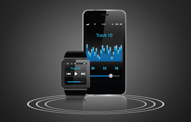
Mobile Web Apps
Mobile web apps are browser based web applications designed specifically for smartphone devices. They are typically written in HTML5. Users first access them as they would access any web page, then are redirected to a special URL (m.example.com). Our web apps have a feature that instructs the user to save the app to their phone’s prime real estate, The home screen. Today’s mobile web app designs give users native-like functionality in the browser, at a fraction of the cost of developing a native app. Our apps come with great reporting functionality (see restaurant case study) where we have the ability to capture data such as page views, page visits, unique visitors, email submissions and phone calls. With this information we can supply key data to each business owner and hone in on the weaker trafficked elements or pages.
Pros
- One version across all mobile ecology
- Affordable and lightning fast load times
Cons
- Requires vanity URL and a redirect from main site
- Doesn’t fully support push notifications yet
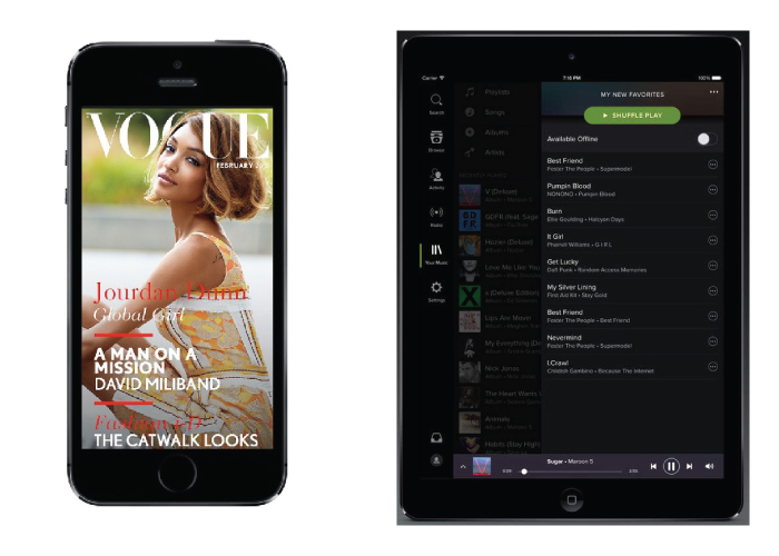
Native Apps
Native Apps offer the fastest, most responsive and most reliable experience to users. Because they are developed specifically for the smartphone, they have added functionality when compared to browser applications. These additions are integrations with existing phone hardware such as the camera, compass, GPS hardware, swipe commands and notifications. Native apps also have the ability to work offline.
Big name brands have flooded the market with Freemium apps. Some great examples of native apps are ESPN, Facebook, Spotify, Draft Kings and Cosmopolitan Magazine. Native app design is best suited to very well established brands. The biggest challenge with these apps is not getting lost in the Apple or Google Play Store amongst the 1 million other apps. Driving initial usership is hard and there is also a challenge to keep engagement after download.
Pros
- They run fast and are smooth
- Ability to send push notifications alerts
Cons
- Cost prohibitive entry point
- Need to develope 2 versions (IOS and Droid)